Thursday, December 2, 2010

New York Time Art Exhibit


I read an article from the New York Times art section. It explored the African styles of art that have crept into Western art and our artistic world today. The article made the point that the art and design of all different material creations are influenced from African design and art. The article critiqued an exhibition that tried to express the influence of African art into our modern designs. The analyzer recognized that in order to create an exhibit that did just this, there would be a good deal of aspects to considered of how to execute it well. The article stated that the exhibit could have in fact been executed better because it did not portray African art in a realistic sense, which the viewer could see is the original design, but could also connect and compare to pieces of art or design that were influenced by the original that they knew. I would agree with the author that it would be a difficult exhibit to execute because often times exhibitions show “high end” art or art that has been highly developed, however the African principles of design do not come in the form of a high end developed art show, therefore the representation is unrealistic. Personally I found this particular article interesting because although it is a trend, I am really attracted to patterns and colors with African origins. Also I think that I would like to see African works in their original form more than Westernized African styles incorporated into modern works.

<http://www.nytimes.com/2010/12/03/arts/design/03mad.html?ref=arts>

Notre-Dame


The work of art I chose is the Cathedral of Notre-Dame in Paris.  I chose it for a couple of reasons, one being the fact that this Cathedral seems to have emerged in movies and such in my childhood and also that it is a very famous Cathedral and quite extravagant. What’s interesting about this piece is that it is survived the French Revolution by a slim margin, so this great work of art and this extravagant place of worship has barely made it to modern day times. Another fascinating quality is that Napoleon himself crowned himself emperor at it’s alter along with many other historically significant times. One of the most beautiful aspects to me personally are the circular designed glass decorative, as well as functional windows on the church. I am drawn to the design of them. Overall I really admire the structure for its history, its collosal size, its intricate design and the fact that it has survived through many rough periods in history when it could have gotten destroyed.

Sunday, November 21, 2010

Roman and Christian Art


The Arch of Constantine stands proud in Rome next to the Colosseum. It is a significant work of art, not only in size and design but because it has great historical and religious significance as well. It is religiously significant because it commemorates the battle that led the Emperor, Constantine to convert to Christianity. That battle is known as the Battle of Milvian Bridge and was fought in 312 A.D. It is said that Constantine had a vision that he was to conquer in the name of the Lord, marching into battle with the cross as his conquering symbol. The Arch was dedicated 3 years later after the victory, in 315 A.D.  The Arch is also symbolic of the Edich of Milan that was issued, which served as a model of religious toleration. The structure itself is made of three arches, with a most of the detailed decoration dating to early fourth century C.E. work.  On the top section there is an inscription over the central arch that states: “To the Emperor Constantine from the Senate and the Roman People. Since through divine inspiration and great wisdom he has delivered the state from the tyrant and his party by his army and noble arms, [we] dedicate this arch, decorated with triumphal insignia.” On either side of the inscription are panels that have been recycled to be put onto this monument and were taken from another. They are relief panels taken from the monument that celebrated the victory of Marcus Aurelius over the Germans in 174 C.E. The piers are immense statues of prisoners, and on the inner walls of the central arch and the attic of the short sides there are reliefs, all which serve to celebrate Trajan’s victory over the Dacians in the early second century C.E. The side arches have a pair of Tondi, or circular compositions, that were taken from another monument, which commemorated Hadrian. Overall this is quite and impressive structure, which was made out of recycled parts to other monuments, and served to commemorate Constantine’s victory to show is power and generosity to the public.
Christians often adapted Roman forms for their own needs. An example of this is seen in the monumental stone sarcophagi. The Sarcophagus of Constantina was constructed in 354 and reached a height of 7’5”. It was constructed out of porphyry and sits in the Musei Vaticani, Vatican, Rome. It is decorated with scenes of putti, which is the process of making wine. The three scenes on the front are framed by three circular shapes of a grapevine. The rest of the swirl shapes above and below the three framed scenes are offshoots from the main vine, but is still part of the larger grapevine. There are peacocks on the rectangular burial structure as well, which symbolize eternal life in paradise in paradise. There is a lone sheep which could be representative of a member of Jesus’ flock, and it is theorized to symbolize Constantina herself. The sides contain other scenes of putti.
The connections between the Roman art and early Christian art may be quite intriguing to an art historian but may be even more intriguing to a Christian. The history of the Roman Empire and art are intertwined with that of the history of Christianity. Christianity existed during the time of the Roman empire and was spread throughout the land of Rome, however Christian were not as popular as when Constantine decided that Christianity was the religion of the Roman Empire. Christians were persecuted and sought out as the opposing minority to the Roman Empire. However as upper-class educated Romans joined the Christian Church they established a cultural influence over the practices, rituals and doctrine of the church. The Christian art that followed the increase in popularity of the religion have roots in Roman visual characteristics. As Christians began to recreate the stories of the Bible into visual pieces, not only would the Roman styles be a prominent part of the representation but they would add to the meaning as well. For example the sarcophagus of Constantina has stylistic features to that of Roman art, the form and the figures can be related to the features of Roman art. The motifs are similar, the theme is one that is found in Roman culture. The silver plate at the beginning of Chapter 7 illustrates the strong linkage between Roman styles and culture with representations of the Christian stories. The stylistic features are that of Roman art and the connection of the story of David and Goliath could have been related to the situation of the emperor and the emperor’s enemies at the time. One other stylistic feature that can be related between the pieces I have already discussed, the Arch of Constantine and the sarcophagus of Constantina, are the circular framed scenes on both structures. Both have figures that are enacting a scene that is symbolic of something else of significance. As one can see, Christian art has been related to Roman art from the beginning.  

Tuesday, November 9, 2010

Greece PROJECT!


Discussion of the Classical Elements in their Historical Context:
The Parthenon is a very intriguing monument which can be found in Nashville, imitating exactly the true structure that can be found in Athens, Greece. It is a classical monument because of its stylistic and humanist elements. For example, the bodies that are on the metopes are balanced and show an idealization of the human bodies. As discussed in class, the humanization of the art relates to the Greeks wanting to socialize with one another. This is shown mainly on the eastern pediment, displaying the Birth of Athena, and the western pediment, displaying the Battle for Athens. Both of these scenes that are displayed on the pediments show interaction between the Greeks. The Battle of Athens shows them interacting by fighting one another, and the Birth of Athena shows interaction between them by expressing a celebration. The style is one of realism.
The strengths seen in the way the humans and gods are expressed in the pediments reflects our reading of the Funeral Oration. While reading the Funeral Oration, we found that Athens was a very war oriented city-state. Their men were trained at very young age for war. Athens was known as a very strong city state that was rarely challenged by choice. Part of this reason was because they were considered to be “group oriented” (Pollitt 11).
 These scenes that are depicted on the pediments also coincide with the idea of “Order and Chaos” that is described in the Pollitt text. On the East Pediment there is Athena who is being birthed form the head of her father, Zeus. According to ancient Greek belief, Athena came out fully clothed in armor. The other figures are said to be the other gods watching this miraculous event. The West Pediment is the famous depiction of the contest between Athena and Poseidon. The contest was over who would be the patron god/goddess of Athens. Surrounding them are horses pulling chariots and while crowds have gathered around to see the event.
When looking the composition of each pediment it really is a beautiful use of space in the triangular confinement of the structure where the stories involving Athena are played out into sculpture. There are gods, goddesses, horses and chariot warriors and speculators all sculpted into figures that are larger than actual human size, and all are stylized yet aesthetic representations of humans and gods done in a very skillful manor. This work is often described as something that is chaotic yet orderly. “Measure and commensurability are everywhere identified with beauty and excellence”, which was the way Plato explained things and is how the Greeks thought as well (Pollitt 4). There was always a search for organization and simplicity. Another uniting factor that brings order to the chaos of the scenes on the pediments is the fact that the figures mainly run through the same vertical plane. They were all made to be contained in the same space, up against a wall, or plane on the top of the Parthenon. This is another stylistic feature of the classical art during the time.
Relating that to the Parthenon, we can tell that it has plenty of organization and simplified order because it is mainly made using the architecture of the Doric Order. Out of the three types of architectural orders, Doric, Ionic, and Corinthian, Doric is the most simplified because it was the first type of Order to emerge, and it does not have as much detail as the other two.
Although the Parthenon takes on the modeled construction of mainly the Doric Order, it also takes on the modeled construction of the Ionic Order because of the columns design. They are designed with the fillets and flutes giving it a simpler look. The columns are one of the main reasons why the Parthenon is so balanced. Commenting on the balance Stockstad says: “One key to the Parthenon’s sense of harmony and balance is an attention to proportion” (Stokstad 130). There is an organized equal amount of space between each column making the entire balance of the Parthenon aesthetically pleasing.

Sunday, October 31, 2010

Greek Pottery

When studying the bell krater it is easy to pick up on the fact that not only did ancient Greek pottery serve as a functional peice of work, but a decorative piece as well. All of ancienct Greek pottery is known to have been decorated in some form and it usually involves intricate work. This particular bell krater was used for mixing wine and water. It was made out of terracotta clay, which is a red colored clay. It was made around 440 B.C. by an artist known as Attic. It is also a red-figured piece, meaning that the figures were painted on in a red slip and details and the backgrounded were added on with a black slip. There are also black figured decorated peices, which are made using the opposite technique. On the obverse side there is a scene of Persephone going back to be with her mother, who happens to be the goddess Demeter and the reverse side is Libation scene. This is just one example of the scenes that would be depicted on these anceint works of art. Often times the scenes involved representations of the gods doing something of significance. Many other painted pots were decorated with the red figure technique. It allowed the artists to paint with greater detail and precision.

Greek pottery was created for a couple of purposes, but has been such a great documentation of history, that people study and reference it today in order to gain knowledge and understande about ancient Greek culture, Greek mythology and caftsmanship of the ancient Greek times. With the different shapes of the vessels and the different stories and ways of representing those stories, Greek pottery are not only functional and culturally significant they are beautiful works of art.

Saturday, October 23, 2010

PREZI!

http://prezi.com/0j3risnlgune/the-anachronism/
Here's our prezi presenatation! Enjoy!

Saturday, October 16, 2010

One of Goya's Drawings

Francisco de Goya is mostly famous for his paintings, however this drawing and wash of his was discovered and is entitled "Joy." I stumbled on an article about this picture and wanted to read about it because I love the simplicity of the space that is made in the drawing. It is composed of two pictures doing what appears to be a dance of some sort, or some kind of embrace. The figures are not completely realistic, but are more characatures or people. In the article is says that the meaning is unknown but to me it seems clear that it is about joy between two people who are very close, perhaps dear friends. The article says however that the two people are "swept off their feet in a state of rapture." The figures are floating in space and with the combinations of their body posture and expressions it seems to portray joy quite perfectly. The figures are not the most handsome of people but it is unimportant to their emotion, for in the drawing, they are living out their feeling of happiness and this is what seems to be important to the artist when creating this drawing. His pictures are captivating and I would love to have something like this hanging in my home to remind me or joy.

<http://www.artnews.com/issues/article.asp?art_id=3084&current=True>

The Anceint Greek Kore

The peice I chose to discuss is the ancient statue of the female Kore. The reason why it was so interesting to me is because it reflects a very stylistic form or ancient sculpture. Usually when someone thinks of ancient Greek sculpture one thinks of the stylized version of the "super human" human beings that are life-like yet enhanced muscles and the bodies with perfect deminsions. This sculpture however pre-dates that era of common ancient Greek sculpture. The smile also known as the "archaic smile" is a slight smile that is deffinatley a noticable smile, however it is not one that is necessarily nature or life-like looking. It suggests that the person is well and filled with life. It is unnatural looking but reflects the ancient Greek culture of people of health and happiness. The sculpture is also a bit stiffer than the other later Greek sculptures. This is characteristic of the time period it was built in as well, which was around the 6th century BCE. The later Greek sculptures have a more relaxed and natural body posture than this sculpture does here. The hair is also stylistic of the era in which it was sculpted. Overall this sculpture is very telling of how the artist viewed and tried to replicate human beings. It is not completely natural but has the aim of representing a human being. The smile, posture and hair all give clues to this. I find it especially interesting being an artist myself.

Sunday, September 26, 2010

Downtown Presbyterian Church!


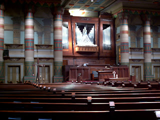
Visiting the downtown Presbyterian Church was quite an expereince. To have a "themed" church or a church decorated in a certain theme for a certain purpose is an interesting and foreign concept for me.  We have been discussing and reading in class how places of architecture give off certain feelings. I deffinately felt dwarfed when walking into this church. There were high ceilings with clouds painted on top to give the illusion of the sky, as well as width and depth that gave the space a very open feeling. I could image that sounds of worship in this building would carry well throghout the space. The church was also very stimulating, there were lots of color and decoration throughout the architecture of the church. For example, the stain-glass windows were decorated in an Egyptian theme with symbolic representations of ancient Egypt, such as blue water droplets symbolizing the Nile River. Another example was the illusion that the columns continued even after the actual 3D stuctures ended because of the trompe l'oeil effect of the painting on the wall. The temples of ancient Egypt were massive in size and were filled with rows of continuous columns. There were many geographical shapes throughout the architecture as well, reflecting ancient Egyptian decor. The actual site for the church made the inside of the church more intriguing because from the outside the building has the characteristics of a church and sits in downtown nashville among towering skyscrapers. No one would know that inside the church is another world, reflecting that of ancient Egypt. As far as the colors go, there were many, including: green, yellow, blue, red and more. The lighting in the church was someone dark, since it was a large church with only side windows, which were stain-glass. However the light that did come in through the windows was very beautiful because it came through the different colors of the window, which included bright blues, yellows, greens and more. The preservation of the church throughout time has been done well. The man who was there to show our class around mentionted that some of the paint it the origional paint from when it was first painted. Overal this expreience was very interesting and intriguing to see. I am glad that we visited this church because I probaly would not have known this existed otherwise.

Thursday, September 16, 2010

Art Review from New York Times!

Franz Xaver Messerschmidt was an 18th century German sculptor who is said to have had mental disturbances which came through in his art. Fascinatingly 19 of his sculptures have been grouped together for a show at the Louvre and travels from Paris to New York. The title of the show is “Franz Xaver Messerschmidt 1736-1783: From Neoclassicism to Expressionism.” Messerschmidt was a sculptor from a young age and by the age of 18 was admitted to a Fine Arts Academy in Vienna. He specializes in busts and portraits of people. He has even done a few busts that are self portraits. His portraits have captivated many over time because of thier extreme expressions. When asked by an interviewer once where he had drawn inspiration he admitted that there were spirits that tomented him and if he did sculptures of them it somehow helped the "spirits" stay subdued. I picked this article simply because the faces captivated me and I wanted to read more and learn more about what the faces were. This artist was known to be a bit crazy mentally and seems to have had disturbances that could not be subdued or reduced to simply nothing or something everyone experiences. Whatever his interactions were with "spirits" or however he was feeling or whatever he was seeing he made amazing sculptured busts of human faces with expressions that draw a viewer in. There is deffinately strong form, line and shape in his sculptures. The expressions in some of them are simple captivating and fun to look at. I enjoyed running into this article about this artist because in fact I had seen the peice before that I put up here but did not know who did it or about the artist so I'm glad to know now.

http://www.nytimes.com/2010/09/17/arts/design/17messerschmidt.html?_r=1&ref=arts

Work of Arte: The Nana Ziggurat

We talked briefly about the Nanna Ziggurat and I was captivated by it in a way. I am interested in places of worship and places were people hold religious ceremonies and traditions. In ancient times they were very much one of the central places of which a community surrounded. The ziggurat is pretty massive in size. It is made out of sun-dried mud brick. This place was also intriguing because it was a center for administrative activities in the city. This place obviously had political and religious significance and was the supposed place where the mood god had chosen to dwell. As far as aesthetics go it was a very solid structure with a sturdy and strong look to it. The walls are slanted upward so that the rain does not pool on the brick and become eroded and damaged quickly. From the appearance it almost looks like a war fort or something of the like. What is interesting is that the foundation has been built upon many times. Over time due to erosion the community would rebuild right on top of the foundation giving it a layered effect. The last time it was built upon was to reconstruct what it would have looked like back when it first existed. I found this aspect of the ziggurat very interesting because when I went to Israel this summer that is what they would do to the stone buildings and community structures there also, they would build upon the foundation after the top part had eroded away. I find that aspect to be quite symbolic of old structures. There is a foundation which is never taken away or destroyed but built upon year after year, which is sort of how history goes, as well as art, there are foundations and principals which will never leave and will always remain, but one part of history or art may fade away or crumble overtime, or even perhaps get lost but it is build upon nonetheless.

Friday, September 10, 2010

Collage!

               My collage has a simple layout. I love simple things in life. I chose a path in some grass to represent a journey which I believe every person is on one. The 15th avenue house represents where Belmont is at as well as the street I live on. There is a house, representing community and the house I live in. There is a picture of a family with the order of birth that my family has and we always went to the beach so it was a good representation for family. There is also a plane which represents that I love to travel and experience new things. The sea creatures in the sky represent creativity. I am the parasailer off the boat and my friends are on the boat, having a good time with me. Everything is relative to history because over history houses, planes and boats have changed and are more relevant to today’s time. The tree also represents history, my history; it is growth over time as well as roots. The world today is open to creativity so I feel that is represented as well in my collage. Art is important to me so I feel it’s simply represented by my creativity and fun I had in creating this collage.


• Decisions: I chose to do a simple layout because it was the first layout that came to me. Also I like simplicity so it fits me well I think. A couple of decisions I made were to have a “sea themed” sky, for two reasons: that being I kept finding excellent sea images in my magazines as well as I love the sea and think the sky and sea are very similar in ways. I chose dirt from the ground to incorporate as well as a little house, family cutout and drawn 15th avenue sign to represent where I live as well as Belmont.

• Color: I chose basic green grass color cutouts for the grass, a painted light blue sky and a white sun faded out to yellow as the main color components. Obviously they work well together because these colors are often found in nature together naturally.

• Light: I chose the sun as my light source. I love the sun and feel it’s symbolic as well. It’s a constant in ever changing times. The light fades out from the sun into the sky

• Texture: Other than the texture found in the cutouts as well as the painted clouds, there is actual texture found in the dirt path. I used dirt from outside my house.

• Volume: There is weight in the tree mainly. I tried to find good tree cutouts that would give the tree texture as well as depth.

• Line: There is implied line between the people on the boat (friends) to the parasailer(me) as well as implied line from the sea turtle and other fish that goes off to the right as well as in the opposing lower corner implied line and direction from the plane flying off my poster to the left.

• Space: There is a foreground which includes the grass and path, which leads to the background which is divided by the horizon line. In the background the house appears smaller in relation to the path in the foreground

• Scale: The creatures in the sky as well as the sun are the largest objects in the collage. The sun is ever present it rises and falls everyday constants are important to me in my life. They keep my grounded. Also I put the sea creatures in the sky to be creative and I love creativity. It is really important to me and who I am.

• Symbolism: The four symbols are: The tree which stands for growth as well as roots, the house stands for community, I live in a community house with 5 other people and it’s important as well as shapes me, the path which represents a journey which I believe everyone is on one that lasts their whole lives, and the fourth is the plane which stands for travelling and being free to leave places as well as go places.

Thursday, September 2, 2010

An Article on Dali and His Later Work

ARTICLE FOUND AT: http://www.nytimes.com/2010/09/03/arts/design/03dali.html?pagewanted=1&ref=design

The article I read was from The New York Times website and it was about Dali and his later work. The article made an interesting statement about Dali and the comparison between his early work and his later work. The article explored the statement that is widely shared among the art world: that Dali's earlier work was a great deal better and included more genius than his later work. It stated that the comparison between his later and earlier work was like comparing apples and oranges. The High Museum of Art in Atlanta has an exibition up of Dali's later work in order to try to show that although different, his later work is still entirely creative, interesting and worth while to look at.

I would have to agree with the article although over time artists and lose their initial creative genius in their work in order to please a higher instituion set in place by society such as fame, money, or the media I still think their talent is what got them there in the first place. He has impecable technique and skill in his work and that shows through in his later work as well. His work is interesting and often times has so many components to explore. If I was in Atlanta I would go to this exhibition.

Starry Night by Van Gogh

Starry Night by Vincent Van Gogh becomes more and more interesting to me everytime it is discussed. What is fascinating to me is that when he was a painter he was nothing, but now that he has come to past people consider his work as genius. One of the reasons why this peice has increasing interest for me everytime it is explored is becuase of Van Gogh himself. Put into context, he was a very poor, disturbed and depressed artist for his artistic career. Someone mentioned in class that he even ate his paints, which I didn't know before. In other words he was in a rut and somewhat desparate for the basic human necessities such as food. In earlier years of talking about this painting I learned that Van Gogh painted this while at an asylum in the 1880's. The painting includes a view of a vibrant night sky looming over a nestled village in the hills with a tall cypress tree to the left. With such a strong composition and vibrant use of color as well as Van Gogh's uniqueness it is not suprising that this peice has caught so many eyes.

There are so mnay strong elements, and that is another reason for talk and admiration in the artist world. First is his strong use of color. There is so much blue and darker cooler colors in this picture but Van Goghs use of accent colors as well as his placement of highlights (in the stars and moon and lower part of the sky) as well as his shadows (in the hills, a bit in the village and in the cypress tree) are quite complementary of one another and provide for a very pleasing aesthetic expereince. He also has a very strong use of texture. He has chopped brush strokes and thickly applied paint of various shades in one are. The texture is intriguing and creates almost a peaceful movement, often found at night. His use of line is well balanced with the horizontal skyline, and the verticle tree. The skyline is not boring however, but made interesting and full of motion with the swirls and curves. Space is done well with around 1/3 the painting being the village and land and 2/3rds the sky. The moon and the tree balance each other out as well as the stars sky are nicely spaced.

Overall Van Gogh is nothing less thank a very expressionistic painter. The peice is intriguing and so is Van Gogh as an artist.

Thursday, August 26, 2010

Favorite Painting:)

I have to be honest and say that with my ever-changing moods and opinions I do not have an "all time" favorite painting, however Flaming June by Fredrick Leighton is a painting that has always been memorable to me. What first captivates me about the painting is the beauty of the woman and the color or the dress. I appreciate the painting because it makes me feel as though the painter found such beauty in this particular woman and portrayed her as beautiful. As far as the color goes, there are many warm shades in this picture, the main one being orange, which is such a bright and lovely color. There are not too many highly contrasting colors in the painting, with mostly browns, tans, and oranges. There is a bit of blue and green in the painting but it is tied in with a mixture of warm colors within these small spots of contrast. The color scheme gives the painting a warm and inviting feeling. It makes me think about a late summer afternoon nap. Another strong aspect of the painting is the use of line. There are many horizontal lines. Even though there are many horizontal lines that can be made out in the painting there is great use of depth so it does not hinder the appearance of the painting to be three-dimensional. It gives a relaxed feeling to me personally. Interestingly there are three distinct sections that can be divided by the three main horizontal lines. The woman takes up about 2/3rds of the painting, which is a suggestion of proportion in artwork. I think another reason why the painting works so well with the horizontal lines is the movement in the folds of the dress and the sheet or whatever it may be that she is lying on. The composition of the piece makes it strong as well. It is quite simple when you think about this painting in the context of its composition. The woman is basically in the center of the painting taking up about two –thirds of the painting. The plant as well as the pole-like object, that is leaning behind the plant in the upper right hand corner adds a nice balance and makes the painting more interesting and aesthetically pleasing. I really enjoy this painting and think it expresses the beauty of a sleeping woman in her gorgeous dress.